Open concept luxury homes are celebrated for their spacious and seamless flow between living areas. Choosing the right interior colors for these open spaces is crucial to creating a harmonious and visually appealing environment. The right palette not only enhances the aesthetic appeal but also defines different zones within the space. This guide will explore the top interior colors used in open concept luxury homes, providing you with the insights needed to transform your home into a luxurious and cohesive masterpiece.
Understanding Open Concept Floor Plan for Luxury Homes
Open concept floor plans are characterized by large, open spaces that combine multiple rooms, such as the kitchen, dining, and living areas, into a single, unified area.
This design promotes a sense of openness, encourages social interaction, and allows for more natural light to flow throughout the space. However, decorating such expansive areas can be challenging, particularly when it comes to selecting and coordinating colors.
Interior Colors Used in Open Concept Luxury Homes: Top Color Trends
Selecting the right interior colors for open concept luxury homes is essential to creating a cohesive and visually stunning environment. The right color palette can highlight the architectural beauty of the space, define different zones, and reflect personal style.
Here are the top color trends to consider for open concept luxury homes.
Neutral Palettes for Open Concept Floor Plans
Neutral colors remain a timeless choice for open concept luxury homes due to their versatility and ability to create a sophisticated, elegant look. Popular neutral colors include shades of white, beige, gray, and taupe. These colors serve as a perfect backdrop for showcasing artwork, furniture, and architectural features. Additionally, neutral palettes can make the space feel larger and more open.
- Popular Neutral Colors and Their Effects:
- Whites and Off-Whites: Create a clean, bright, and airy feel.
- Beiges and Taupes: Add warmth and coziness without overwhelming the space.
- Grays: Offer a modern and sleek aesthetic, versatile enough to complement various styles.
- Examples and Inspiration from Luxury Homes:
- A luxury penthouse in Manhattan featuring soft gray walls, white trim, and taupe furnishings.
- A beachfront villa in Malibu with off-white walls and beige accents, enhancing natural light and ocean views.

This is an example of how Rita Chraibi always breaks the mold by infusing a dynamic fashion combined with ultra-luxury interior design. Dicover the gallery of this project in her portfolio.
Bold and Vibrant Choices in Modern Open Concept Homes
For those who prefer a more dynamic and lively atmosphere, bold and vibrant colors can add personality and energy to an open space. When used correctly, these colors can create striking focal points and enhance the overall design without overwhelming the space.
How to Incorporate Bold Colors Without Overwhelming the Space
- Accent Walls: Choose a single wall to paint in a bold color, creating a dramatic effect while keeping the rest of the space neutral.
- Vibrant Furniture: Incorporate bold-colored furniture pieces, such as a royal blue sofa or a red armchair, to add pops of color.
- Colorful Decor: Use vibrant accessories like throw pillows, rugs, and artwork to introduce bold colors in smaller doses.
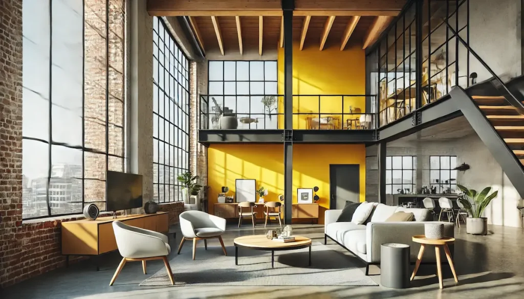
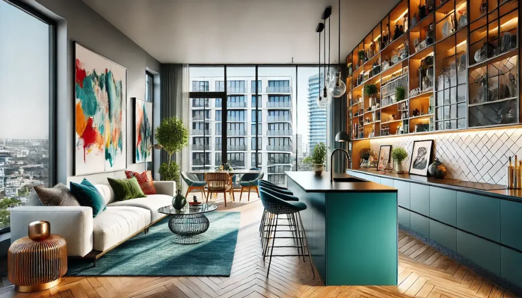
Case Studies of Luxury Homes with Bold Color Schemes
A modern loft in downtown LA featuring a bright yellow accent wall paired with neutral furniture.
A chic urban apartment with a striking teal kitchen island and colorful artwork throughout the living area.
Earthy Tones for Open Space Color Palette
Earthy tones bring a touch of nature indoors, creating a cozy and inviting atmosphere while maintaining a luxurious feel. These colors are inspired by natural elements like wood, stone, and greenery, making them perfect for creating a warm and welcoming environment.
- Benefits of Using Earthy Tones:
- Warmth and Comfort: Earthy colors such as rich browns, terracotta, and olive greens add a sense of warmth and comfort.
- Versatility: These colors work well with various design styles, from rustic to contemporary.
- Connection to Nature: Earthy tones help create a serene and grounding environment.
By incorporating these top color trends, you can enhance the beauty and functionality of your open concept luxury home, creating a space that is both stylish and harmonious.
Coordinating Colors Across Open Concept Luxury Homes
Coordinating colors in an open concept luxury home requires careful planning to ensure a seamless and harmonious look throughout the space. Here are some effective strategies to achieve a cohesive color palette:
Use of Accent Walls and Focal Points
Accent walls and focal points are excellent ways to add visual interest and define different areas within an open space. By selecting a single wall to feature a bold or contrasting color, you can create a dramatic effect without overwhelming the entire room. This technique helps to draw attention to specific areas, such as a fireplace, a piece of artwork, or a unique architectural element.
Integrating Furniture and Decor
The furniture and decor you choose play a crucial role in tying the color scheme together. Selecting pieces that complement your chosen palette ensures a unified look. Consider using furniture in neutral tones and adding colorful accents through accessories like pillows, rugs, and artwork.
Creating Smooth Transitions Between Spaces
In an open concept home, it’s essential to create smooth transitions between different areas to maintain a cohesive look. This can be achieved by using a consistent color palette and gradually transitioning shades from one area to another.
By implementing these strategies, you can ensure that your open concept luxury home has a cohesive and harmonious color scheme that enhances the overall aesthetic and functionality of the space.
Interior Colors Used in Open Concept Luxury Homes: Common Mistakes to Avoid
When choosing interior colors for open concept luxury homes, it’s important to be mindful of common pitfalls that can detract from the overall design. Here are some mistakes to avoid:
Overuse of a Single Color
While consistency is key in an open concept home, using too much of a single color can make the space feel monotonous and uninspired. It’s important to incorporate a variety of hues to add depth and interest.
- Solution: Introduce complementary and accent colors to break up large expanses of the same color. For instance, if your primary color is a neutral beige, add pops of color with accessories or furniture in shades of blue or green.
Ignoring Natural Light
Natural light has a significant impact on how colors appear in your home. Ignoring the influence of natural light can result in colors that look different than expected, potentially clashing with the intended design.
- Solution: Test paint samples on your walls and observe how they change throughout the day with varying natural light. Choose colors that look appealing in both bright daylight and dim evening light.
Poor Transitions Between Spaces
Inconsistent color transitions can disrupt the flow of an open concept home, making it feel disjointed and chaotic. Each area should blend seamlessly into the next to maintain a harmonious look.
- Solution: Use a consistent color palette with varying shades to create smooth transitions. For example, transition from a light gray in the living room to a slightly darker gray in the dining area, and then to a rich charcoal in the kitchen.
Overwhelming the Space with Bold Colors
While bold colors can add personality, using them excessively can overwhelm the space and create a chaotic atmosphere. It’s important to strike a balance.
- Solution: Reserve bold colors for accent walls, furniture, or decor items rather than large surfaces. This approach allows you to enjoy vibrant hues without overpowering the space.
Neglecting the Ceiling
The ceiling is often overlooked when choosing colors, but it plays a crucial role in the overall look of the space. A poorly chosen ceiling color can make the room feel disjointed or out of balance.
- Solution: Consider the ceiling as part of your overall color scheme. A lighter shade of your wall color can create a cohesive look, or you can use a contrasting color to add interest and draw the eye upward.
By avoiding these common mistakes and carefully planning your color scheme, you can create a beautiful and cohesive open concept luxury home that reflects your personal style and enhances the space’s functionality.
Frequently Asked Questions (PAA)
What Are the Best Colors for Open Concept Homes?
The best colors for open concept homes are those that promote a cohesive and harmonious look while defining different areas within the space. Neutral colors such as whites, beiges, and grays are popular choices because they create a clean and sophisticated backdrop. Additionally, earthy tones and soft pastels can add warmth and character without overwhelming the space.
How Do You Coordinate Colors in an Open Floor Plan?
Coordinating colors in an open floor plan involves using a consistent color palette with complementary shades. Start with a base color for the main areas and introduce secondary colors for accents and specific zones. Use gradual transitions between shades to maintain a seamless flow, and incorporate common elements like trim and flooring to tie the spaces together.
What Are Some Popular Color Schemes for Luxury Homes?
Popular color schemes for luxury homes include:
- Monochromatic: Utilizing various shades of a single color for a sophisticated and cohesive look.
- Analogous: Combining colors that are next to each other on the color wheel, such as blues and greens, to create a harmonious and relaxing environment.
- Complementary: Pairing colors opposite each other on the color wheel, like blue and orange, for a bold and dynamic contrast.
Can You Use Dark Colors in Open Concept Spaces?
Yes, you can use dark colors in open concept spaces, but it’s important to balance them with lighter tones to avoid making the space feel too enclosed. Dark colors can add depth and drama when used strategically, such as on accent walls or in smaller areas. Ensure ample lighting and incorporate contrasting elements to keep the space feeling open and airy.
How Do You Make a Cohesive Color Palette?
To make a cohesive color palette:
- Choose a Base Color: Start with a neutral or muted base color for the majority of the space.
- Add Complementary Colors: Select complementary or analogous colors for accents and secondary areas.
- Use Consistent Elements: Repeat certain colors in different elements, such as furniture, decor, and textiles, to create a sense of unity.
- Consider Natural Light: Adjust your palette based on how natural light affects color perception throughout the day.
Conclusion
Choosing the right interior colors for open concept luxury homes is essential for creating a cohesive and aesthetically pleasing environment. By considering factors like lighting, balance, and flow, you can transform your open space into a luxurious haven that reflects your personal style.
For personalized advice and to ensure the best results, consider consulting with a professional designer. An expert like the award-winning interior designer Rita Chraibi can offer tailored recommendations and innovative solutions to elevate your home’s interior design. Whether you are revamping your existing space or designing a new one, professional guidance can make a significant difference in achieving a luxurious and cohesive look. Get in touch now and request a consultation.

